Session Review
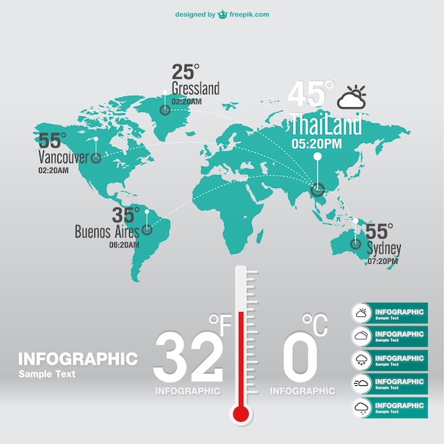
Proceeding from session five, I discovered an excellent example of a info graphic weather report. The consistent three colour tone enforced my concept of having a balance of darker and lighter shades for my map. The infographic weather report will be used as a visual reference for my improved map design since I like the arrangement of typography featured in the weather report image.
Furthermore, I also browsed through the internet, newspapers, television and radio to choose a topic of news which would allow me to create a info graphic diagram and I thought he construction of new houses being built in the United Kingdom would be an excellent topic of news to discuss along with the anger of people in London losing their homes
By Sebastian Jones
References
https://image.freepik.com/free-vector/weather-forecast-infographic_23-2147495349.jpg
http://www.bbc.co.uk/news/business-34741331
http://www.bbc.co.uk/news/magazine-30776306
Comments
Post a Comment